Fix This Ad No. 1 – Coca-Cola, “Open”
Author’s note: “Fix This Ad” is an admittedly blatant attempt at armchair quarterbacking produced work. While the advice given is directed at the agency, I have no actual knowledge as to who is responsible for what perceived problems I aim to correct. That is, I have no accurate way of knowing the difference between a creative misjudgment and a client mandate. Although let’s be honest, most client mandates stick out like a logo made 10-percent bigger three too many times.
—
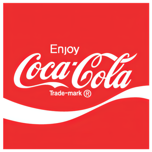 So. Let’s kick off this whole “Fix This Ad” affair with a real challenge: a spot by Wieden+Kennedy for Coca-Cola entitled “Open.” A piece that is, in its current form, better than 99.999% of what you’ll see out in the wild today. Or even among the pieces being shared amongst the advertising social media gang. Why attempt to, ahem, fix something that doesn’t readily appear to be broken? Because the one thing it’s missing is quite an important piece. But more on that later.
First, the spot:
The Good: This is an incredibly well-constructed spot. Set aside the production values for a moment and just focus on the storytelling. Yes, that’s a much-overused word in the ad industry, but this spot does actually tell a story (which is admittedly easier to do when you’re selling something like Coke instead of, say, medical devices), and does so with aplomb. The initial shot is arresting, grabbing our interest from the first frame. But we have no real idea what’s going on beyond it being a hot day in some unknown metropolis (implied more by the color grading than any overt character cues – that’s a compliment, by the way). Everyone we see is irritated. Why? We don’t really know. But cracks start to appear. Minor at first, almost as if they could be natural and coincidental to the heat. Such thoughts quickly end with the slamming of a window and the collapse of a fire escape. The deterioration escalates along with the internal temperatures of the people on the street. Cracks in the world, cracks in their souls. The whole world is literally cracking up. And the production values (which you probably couldn’t really ignore) are purposeful. This was not a cheap spot to produce. But I’d wager it didn’t cost any more than many of those montage spots that feature multiple locations, beautiful photography, and banal voice overs. Here, the money makes the story better instead of trying to distract from a weak concept. Am I jealous? That would be unbecoming. But yes. Yes, I am.
The Problem: When our heroine – the smoky-voiced sassmaster Natasha Lyonne – nonchalantly informs the bickering hordes that they should consider giving the other person’s point of view a look-see, there is zero connection to the brand. We don’t even know it’s a Coke ad until the scene cuts to what old ad grunts like me call a donut. It’s almost as if they’re going out of their way to avoid any hint of the groantacular debacle that was the Kendall Jenner Pepsi spot. But with absolutely zero in-the-scene branding until the stinger with the robot and mouse, this spot could actually be one about which a client may utter the dreaded words, “You could put anyone’s logo on that.” Often, they are wrong for various reasons. But in this case, they would be correct.
The Solution: Fear not. As my allusion to the Pepsi spot might clue you into, I would never suggest Natasha pull out a couple bottles of Coca-Cola Classic from her bag and hand them to the dueling super-beings. She is not Mean Joe Greene and this is not 1979. But I do believe two changes would make this spot more on-brand without, as I like to say, poking the audience with a virtual elbow (as in Get it? Huh? Do ya?). First, Natasha should be holding an open bottle of Coke. She doesn’t even have to drink it. Just holding it while espousing her common-sense-yet-often-ignored mantra ties the brand to her street smarts and good vibes. Which is kind of the point of the spot, yes? Second, under the donut’s title card I would add audio effects of a bottle being opened – the classic cap pop and carbonated fizz that generations associated with pressurized sugary relief. It matches the line “everything’s better when we’re open” perfectly and adds a nice audio mnemonic to the piece. Nothing major editorially, really. But pretty darned important from a branding perspective.
You’re welcome, Dan. My invoice is in the mail.